Introduction
A recent news article published in the national daily, The Star, reported, “The country’s unemployment rate has inched up by 0.1 percentage points to 3.5% in December 2016 compared to the previous month, according to the Statistics Department. On a year-on-year comparison, the unemployment rate was also up 0.1 percentage point from December 2015. It said that in December 2016, 14,276,700 people were employed out of the country’s total labour force of 14,788,900, while 512,000 were unemployed.” The news daily also reported that, “Human Resources Minister Datuk Seri Richard Riot said the country’s unemployment rate was still “manageable” and unlikely to exceed 3.5% this year despite the global economic slowdown.”
In this analytical study, we have made an attempt to verify this claim by regressing the employed work force in Malaysia on predictors like Outside Labor Force, Unemployment percentage, Labour Force and others.
This study is organized as follows;
-
Business/Research Question
-
Data Source
-
Making data management decisions
- Data preprocessing (rename and replace)
- Data preprocessing (joining the tables)
- Data preprocessing (missing data visualization & imputation)
- One-way table
- Two-way table
- Test of independence for categorical variables
- Visualizing significant variables found in the test of independence
- Boxplots for outlier detection
- Outlier Treatment
- Data type conversion
- Detecting skewed variables
- Skewed variable treatment
- Correlation detection
- Multicollinearity
- Multicollinearity treatment * Principal Component Analysis (PCA) * Plotting the PCA (biplot) components * Determining the contribution (%) of each parameter
-
Predictive Data Analytics
A. Creating the train and test dataset
B. Model Building - Evaluation Method
C. Model Building - Regression Analysis
D. Model Building - other supervised algorithms
- Regression Tree method
- Random Forest method
E. Model Performance comparison
-
Conclusion
1. Business/Research Question
Determine the factors which contribute to accurately predicting unemployment rate from historical statistical data on labour force data in Malaysia.
2. Data Source
The data comes from the Department of Statistics, Malaysia. This is an open data source portal and the data files can be accessed from their official website. Click the + sign next to “Labour Force & Social Statistics” to expand the drop down list to access the data files.
3. Making data management decisions
Initially, the dataset consisted of five comma-separated files. Each file provided data (from year 1965 to year 2014) on factors like number of rubber estates in Malaysia, total planted area, production of natural rubber, tapped area, yield per hectare and total number of paid employees in the rubber estate.
A. Exploratory Data Analysis (EDA)
This phase constitutes 80% of a data analytical work. We noticed that each data file consisted of 544 rows in 3 variables where the variable, Year was common for all data tables. This confirmed our assumption that the actual dataset was divided into six separate files. We first imported the data files into the R environment as given;
> df1<- read.csv("data/bptms-Employed_by_State.csv", header = TRUE, sep = ",", stringsAsFactors = FALSE)
> df2<- read.csv("data/bptms-Labour_force_by_State.csv", header = TRUE, sep = ",", stringsAsFactors = FALSE)
> df3<- read.csv("data/bptms-Labour_Force_Participation_rate_by_State.csv", header = TRUE, sep = ",", stringsAsFactors = FALSE)
> df4<- read.csv("data/bptms-Outside_labour_force_by_State.csv", header = TRUE, sep = ",", stringsAsFactors = FALSE)
> df5<- read.csv("data/bptms-Unemployment_Rate.csv", header = TRUE, sep = ",", stringsAsFactors = FALSE)

> dim(df1)
[1] 544   3
> dim(df2)
[1] 544   3
> dim(df3)
[1] 544   3
> dim(df4)
[1] 544   3
> dim(df5)
[1] 544   3
Now that the data was imported in, we began with the initial process of data exploration. The first step was to look at the data structure for which we used the str() as given;
> str(df1)
'data.frame':	544 obs. of  3 variables:
 $ Year           : int  1982 1983 1984 1985 1986 1987 1988 1989 1990 1992 ...
 $ State.Country  : chr  "Malaysia" "Malaysia" "Malaysia" "Malaysia" ...
 $ Employed...000.: chr  "5,249.00" "5,457.00" "5,566.70" "5,653.40" ...
and found that variable like, Employed was treated as a character data type by R because it’s values contained a comma in them. Thus, coercing the number to a character data type. We also need to rename the variables to short, succinct names. The variable naming convention will follow CamelCase style.
- Data preprocessing (rename and replace)
We begin by renaming the variable names. We will use the rename() of the plyr package. This library needs to be loaded in the R environment first. We use the gsub() to replace the comma between the numbers in the Employed variable, followed by changing the data type to numeric. We show the data management steps as follows;
> library(plyr) # for the rename ()
> df1<- rename(df1, c("State.Country" = "State"))
> df1<- rename(df1, c("Employed...000." = "Employed"))
> df2<- rename(df2, c("State.Country" = "State"))
> df2<- rename(df2, c("Labour.Force...000." = "LabrFrc"))
> df3<- rename(df3, c("State.Country" = "State"))
> df3<- rename(df3, c("Labour.Force.Participation.Rate..Percentage." = "LabrFrcPerct"))
> df4<- rename(df4, c("State.Country" = "State"))
> df4<- rename(df4, c("Outside.Labour.Force...000." = "OutLabrFrc"))
> df5<- rename(df5, c("State.Country" = "State"))
> df5<- rename(df5, c("Unemployment.Rate..Percentage." = "UnempRatePerct"))

> ## Change data type
> df1$State<- as.factor(df1$State)
> df1$Employed<- as.numeric(gsub(",","", df1$Employed))
> df2$State<- as.factor(df2$State)
> df2$LabrFrc<- as.numeric(gsub(",","", df2$LabrFrc))
> df3$State<- as.factor(df3$State)
> df4$State<- as.factor(df4$State)
> df4$OutLabrFrc<- as.numeric(gsub(",","", df4$OutLabrFrc))
> df5$State<- as.factor(df5$State)
- Data preprocessing (joining the tables)
Next, we apply the inner_join() of the dplyr package to join the five data frames to a single master data frame called, df.master. To check the time it takes for data table joins, we wrap the inner join function in system.time() method; Since, this is a small dataset so there are not much overheads involved in an operation like inner join but for large data tables, system.time() is a handy function.
> library(dplyr)
> system.time(join1<- inner_join(df1,df2))
Joining, by = c("Year", "State")
   	user  system elapsed
   	0.00    0.00    0.47
> system.time(join2<- inner_join(df3,df4))
Joining, by = c("Year", "State")
   	user  system elapsed
  0       0       0
> system.time(join3<- inner_join(join1,join2))
Joining, by = c("Year", "State")
   	user  system elapsed
  0       0       0
> system.time(df.master<- inner_join(join3,df5))
Joining, by = c("Year", "State")
   	user  system elapsed
  0       0       0
Let us look at the structure of the data frame, df.master
>  str(df.master)
'data.frame':	544 obs. of  7 variables:
 	$ Year          : int  1982 1983 1984 1985 1986 1987 1988 1989 1990 1992 ...
 	$ State         : Factor w/ 17 levels "Johor","Kedah",..: 4 4 4 4 4 4 4 4 4 4 ...
 	$ Employed      : num  5249 5457 5567 5653 5760 ...
 	$ LabrFrc       : num  5431 5672 5862 5990 6222 ...
 	$ LabrFrcPerct  : num  64.8 65.6 65.3 65.7 66.1 66.5 66.8 66.2 66.5 65.9 ...
 	$ OutLabrFrc    : num  2945 2969 3120 3125 3188 ...
 	$ UnempRatePerct: num  3.4 3.8 5 5.6 7.4 7.3 7.2 5.7 4.5 3.7 ...
- Data preprocessing (missing data visualization & imputation)
Let us visualize the data now. The objective is to check for missing data patterns. For this, we will use the aggr_plot() function of the VIM package.
> library(VIM)
> aggr_plot <- aggr(df.master, col=c('navyblue','red'), numbers=TRUE, sortVars=TRUE, labels=names(df.master), cex.axis=.7, gap=3,                    ylab=c("Histogram of missing data","Pattern"))
   Variable      Count
   Employed 0.05330882
   LabrFrc 0.05330882
   	   	LabrFrcPerct 0.05330882
 	OutLabrFrc 0.05330882
 		UnempRatePerct 0.05330882
    Year 0.00000000
    State 0.00000000

Warning message:
In plot.aggr(res, ...) : not enough horizontal space to display frequencies
Note: The warning message is generated because the plot size is not big enough. I’m using RStudio, where the plot size is small. You can safely ignore this message.
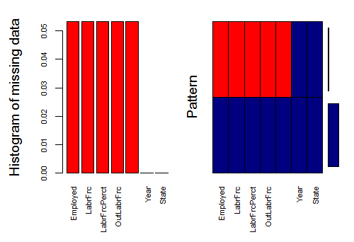
Fig-1: Missing Data Visualization
In Fig-1, the missing data is shown in red color. Here we see that variables like Employed, LabrFrc, LabrFrcPerct and OutLabrFrc have missing data. To verify, how many instances of missing values are there, use, colSums() like
> colSums(is.na(df.master))
      Year          State       Employed        LabrFrc   LabrFrcPerct     OutLabrFrc UnempRatePerct
         0              0             29             29             29             29             29  There are 29 instances of missing data. In an earlier case study, we had used the `Boruta` package for missing data imputation. We tried it on this case study and it failed to impute all missing values, quite a strange phenomenon. Anyway, for this case study we have used the `missForest` method from the `missForest` package. You will have to install/load it in the `R` environment first if you do not have it. We save the imputed data in a new data frame called, `df.cmplt`.

> ## MISSING DATA IMPUTATION
> library(missForest)
> imputdata<- missForest(df.master)
  	missForest iteration 1 in progress...done!
  	missForest iteration 2 in progress...done!
# check imputed values
> imputdata$ximp
Year             State  Employed   LabrFrc LabrFrcPerct OutLabrFrc UnempRatePerct
1   1982          Malaysia  5249.000  5431.400       64.800  2944.6000          3.400
2   1983          Malaysia  5457.000  5671.800       65.600  2969.4000          3.800
3   1984          Malaysia  5566.700  5862.500       65.300  3119.6000          5.000
4   1985          Malaysia  5653.400  5990.100       65.700  3124.9000          5.600
5   1986          Malaysia  5760.100  6222.100       66.100  3188.3000          7.400
[ reached getOption("max.print") -- omitted 530 rows ]
# assign imputed values to a data frame
> df.cmplt<- imputdata$ximp
# check for missing values in the new data frame
> colSums(is.na(df.cmplt))
      Year          State       Employed        LabrFrc   LabrFrcPerct     OutLabrFrc UnempRatePerct
         0              0              0              0              0              0              0
B. Basic Statistics
We now provide few basic statistics on the data like frequency tables (one way table, two way table, proportion table and percentage table).
- One-way table
Simple frequency counts can be generated using the table() function.
> mytable<- with(data=df.cmplt, table(State))
> mytable
State
        Johor             Kedah          Kelantan          Malaysia            Melaka   Negeri Sembilan
           32                32                32                32                32                32
       Pahang             Perak            Perlis      Pulau Pinang             Sabah           Sarawak
           32                32                32                32                32                32
     Selangor        Terengganu        W.P Labuan W.P. Kuala Lumpur     W.P.Putrajaya
           32                32                32                32                32  * **Two-way table**
For two-way table, the format for the table() is mytable<- table(A,B) where A is the row variable and B is the column variable. Alternatively, the xtabs() function allows to create a contingency table using the formula style input. The format is mytable<- xtabs(~ A + B, data=mydata) where, mydata is a matrix of data frame. In general, the variables to be cross classified appear on the right side of the formula (i.e. to the right side of the ~) separated by + sign.
Use prop.table(mytable) to express table entries as fractions.
- Test of independence for categorical variables
R provides several methods for testing the independence of the categorical variables like chi-square test of independence, Fisher exact test, Cochran-Mantel-Haenszel test.
For this report, we applied the chisq.test() to a two-way table to produce the chi square test of independence of the row and column variable as shown next;
> library(vcd) # for xtabs() and assocstats()
Loading required package: grid
> mytable<- xtabs(~State+Employed, data= df.cmplt)
> chisq.test(mytable)

Pearson's Chi-squared test

data:  mytable
X-squared = 8534, df = 8368, p-value = 0.1003

Warning message:
In chisq.test(mytable) : Chi-squared approximation may be incorrect
Here, the p value is greater than 0.05, indicating no relationship between state & employed variable. Let’s look at another example as given below;
> mytable<- xtabs(~State+UnempRatePerct, data= df.cmplt)
> chisq.test(mytable)

Pearson's Chi-squared test

data:  mytable
X-squared = 2104.2, df = 1776, p-value = 0.00000009352

Warning message:
In chisq.test(mytable) : Chi-squared approximation may be incorrect
Here, the p value is less than 0.05, indicating a relationship between state & Unemployed rate percent variable.
> mytable<- xtabs(~State+LabrFrcPerct, data= df.cmplt)
> chisq.test(mytable)

Pearson's Chi-squared test

data:  mytable
X-squared = 3309.2, df = 2928, p-value = 0.0000008368
Again, the p value is less than 0.05, indicating a relationship between state & labour force in percentage variable
Therefore, to summarise, the significance test conducted using chi-square test of independence evaluates whether or not sufficient evidence exists to reject a null hypothesis of independence between the variables. We could not reject the null hypothesis for State vs Employed, Labour Force and Outside Labour Force variables confirming that there exists no relationship between these variables.
However, we were unable to reject the null hypothesis for state vs UnempRatePerct and LabrFrcPerct. This proves that there exist a relationship between these variables.
Unfortunately we cannot test the association between the two categorical variables State and Year, because the measures of association like Phi and Cramer’s V require the categorical variables to have at least two levels example "Sex" got two levels, "Male", "Female". Use the assocstats() from the vcd package to test association.
Now, that we have determined the variables that have relationships with each other, we continue to the next step of visualizing their distribution in the data. We have used density plots for continuous variable distribution.
- Visualizing significant variables found in the test of independence
We have used the ggplot2 library for data visualization. The plots are shown in Fig-2 and Fig-3 respectively.
> ggplot(df.cmplt)+
...   geom_density(aes(x=LabrFrcPerct, fill="red"))
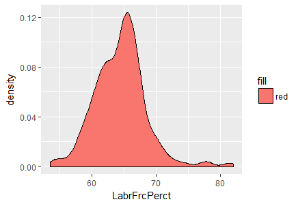
Fig-2: Density plot for variable, LabrFrcPerct
In Fig-2, we see that a majority of the labor force in Malaysia lies between the 60-70 percentage bracket.
> ggplot(df.cmplt)+
...   geom_density(aes(x=UnempRatePerct, fill="red"))
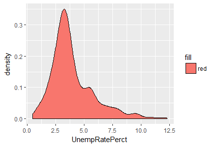
Fig-3: Density plot for variable, UnempRatePerct
From Fig-3, its evident that a majority of unemployment rate peaks between 2.5 to 5.0 interval.
We now, derive a subset of the data based on the significant variation revealed in Fig-2 and Fig-3 respectively for further data analysis.
> subst.data.2<- subset(df.cmplt,
...                     (LabrFrcPerct>=60 & LabrFrcPerct <=70) &
...                     (UnempRatePerct>=2.5 & UnempRatePerct<=5.0)
...                     )
This reduces the dataset size to 269 observations as given in > dim(subst.data.2)
[1] 269 7
C. Outlier Detection & Treatment
Outlier treatment is a vital part of descriptive analytics since outliers can lead to misleading conclusions regarding our data. For continuous variables, the values that lie outside the 1.5 * IQR limits. For categorical variables, outliers are considered to be the values of which frequency is less than 10% outliers gets the extreme most observation from the mean. If you set the argument opposite=TRUE, it fetches from the other side.
- Boxplots for outlier detection
When reviewing a boxplot, an outlier is defined as a data point that is located outside the fences (“whiskers”) of the boxplot (e.g: outside 1.5 times the interquartile range above the upper quartile and bellow the lower quartile).
Remember, ggplot2 requires both an x and y variable of a boxplot. Here is how to make a single boxplot as shown by leaving the x aesthetic blank;
>p1<-ggplot(data= df.cmplt, aes(x="", y=Employed))+
  	geom_boxplot(outlier.size=2,outlier.colour="red")
>p2<-ggplot(data= df.cmplt, aes(x="", y=LabrFrc))+
  	geom_boxplot(outlier.size=2,outlier.colour="red")
>p3<-ggplot(data= df.cmplt, aes(x="", y=OutLabrFrc))+
  	geom_boxplot(outlier.size=2,outlier.colour="red")

> p1+ ggtitle("Employed in Malaysia (1982-2014)")+
  	xlab("")+ylab("Employed")
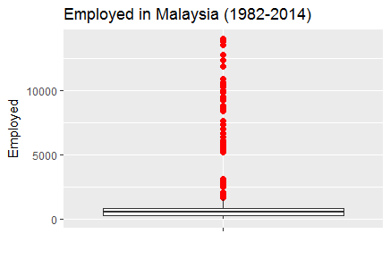
Fig-4: Boxplot for outliers detected in variable Employed
> p2+ ggtitle("Labour Force in Malaysia (1982-2014)")+
  	xlab("")+ylab("Labour Force")
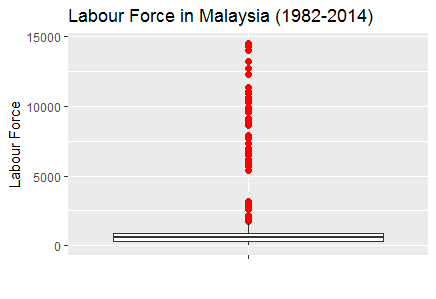
Fig-5: Boxplot for outliers detected in variable LabrFrc
> p3+ ggtitle("Outside Labour Force in Malaysia (1982-2014)")+
  	xlab("")+ylab("Outside Labour Force")
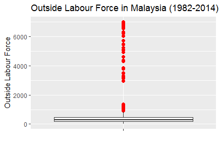
Fig-6: Boxplot for outliers detected in variable OutLabrFrc
- Outlier Treatment
One of the method is to derive a subset to remove the outliers. After, several trials of plotting boxplots, we found that variable LabrFrc when less than or equal to 1600 generates no outliers. So, we subset the data frame and call it as, subst.data.3.
> subst.data.3<- subset(df.cmplt,
                  (LabrFrc<=1200 & LabrFrcPerct>=60 & LabrFrcPerct <=70) &
                    (UnempRatePerct>=2.5 & UnempRatePerct<=5.0)
> dim(subst.data.3)
[1] 221   7
We then plot this new data frame devoid of outliers as shown in Fig-7,8,9.
> p1<-ggplot(data= subst.data.3, aes(x="", y=Employed))+
  geom_boxplot(outlier.size=2,outlier.colour="red")
> p2<-ggplot(data= subst.data.3, aes(x="", y=LabrFrc))+
  geom_boxplot(outlier.size=2,outlier.colour="red")
> p3<-ggplot(data= subst.data.3, aes(x="", y=OutLabrFrc))+
  geom_boxplot(outlier.size=2,outlier.colour="red")

p1+ ggtitle("Employed in Malaysia (1982-2014)")+
  xlab("")+ylab("Employed")
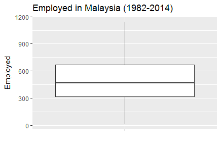
Fig-7: Boxplot with outliers treated in variable Employed
> p2+ ggtitle("Labour Force in Malaysia (1982-2014)")+
  	xlab("")+ylab("Labour Force")
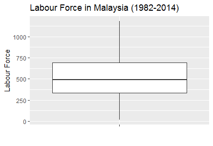
Fig-8: Boxplot with outliers treated in variable LabrFrc
> p3+ ggtitle("Outside Labour Force in Malaysia (1982-2014)")+
  	xlab("")+ylab("Outside Labour Force")
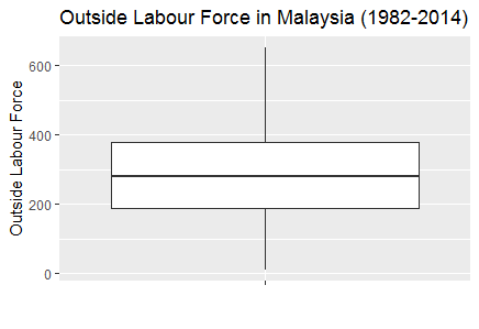
Fig-9: Boxplot with outliers treated in variable OutLabrFrc
A simple and easy way to plot multiple plots is to adjust the par option. We show this as follows;
> par(mfrow=c(1,5),col.lab="blue", fg="indianred") # divide the screen into 1 row and five columns
> for(i in 3:7){
...  boxplot(subst.data.2[,i], main=names(subst.data.3[i]))
... }
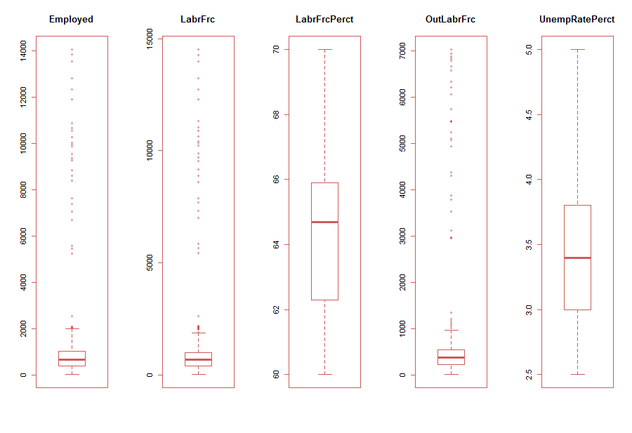
Fig-10: Easy alternative method to plot multiple boxplot with outliers
As is evident in Fig-10, the variables, Employed, LabrFrc and OutLabrFrc show clear indications of outliers. Subsequently, in Fig-11, we show multiple boxplots with outliers treated.
> par(mfrow=c(1,5)) # divide the screen into 1 row and four columns
> for(i in 3:7){
...   boxplot(subst.data.3[,i], main=names(subst.data.3[i]))
... }

Fig-11: Multiple boxplot with outliers treated
- Data type conversion
For subsequent data analytical activities, we converted the factor data type of the variable, State to numeric. Note, there were 17 levels in the State variable.
> table(df.cmplt$State)

        Johor             Kedah          Kelantan          Malaysia            Melaka   Negeri Sembilan
            7                19                12                 0                 8                28
       Pahang             Perak            Perlis      Pulau Pinang             Sabah           Sarawak
           26                12                 7                 7                 4                11
     Selangor        Terengganu        W.P Labuan W.P. Kuala Lumpur     W.P.Putrajaya
            4                13                16                20                27

> df.cmplt$State<-as.factor(gsub("W.P.Putrajaya","Putrajaya", df.cmplt$State,ignore.case=T))
> df.cmplt$State<-as.factor(gsub("W.P. Kuala Lumpur","Kuala Lumpur", df.cmplt$State,ignore.case=T))
> df.cmplt$State<-as.factor(gsub("W.P Labuan","Labuan", df.cmplt$State,ignore.case=T))
> df.cmplt$State<- as.numeric(df.cmplt$State)
D. Correlation Detection & Treatment
- Detecting skewed variables
A variable is considered, highly skewed if its absolute value is greater than 1. A variable is considered, moderately skewed if its absolute value is greater than 0.5.
skewedVars <- NA
> library(moments) # for skewness function
for(i in names(subst.data.3)){
  	if(is.numeric(subst.data.3[,i])){
		if(i != "UnempRatePerct"){
  			# Enters this block if variable is non-categorical
  			skewVal <- skewness(subst.data.3[,i])
  			print(paste(i, skewVal, sep = ": "))
  			if(abs(skewVal) > 0.5){
    			skewedVars <- c(skewedVars, i)
  				}
			}
  			}
	}

[1] "Year: -0.0966073203178181"
[1] "State: 0"
[1] "Employed: 4.02774976187303"
[1] "LabrFrc: 4.00826453293672"
[1] "LabrFrcPerct: 0.576284963607043"
[1] "OutLabrFrc: 4.03480268085273"
We find that the variables, Employed, LabrFrc and OutLabrFrc are highly skewed.
- Skewed variable treatment
Post identifying the skewed variables, we proceed to treating them by taking the log transformation. But, first we rearrange/reorder the columns for simplicity;
> ## reorder the columns in df.cmplt data frame
> df.cmplt<- df.cmplt[c(1:2,4:5,3,6:7)]
> str(df.cmplt)
'data.frame':	544 obs. of  7 variables:
 	$ Year          : num  1982 1983 1984 1985 1986 ...
 	$ State         : num  6 6 6 6 6 6 6 6 6 6 ...
 	$ UnempRatePerct: num  3.4 3.8 5 5.6 7.4 7.3 7.2 5.7 4.5 3.7 ...
 	$ LabrFrcPerct  : num  64.8 65.6 65.3 65.7 66.1 66.5 66.8 66.2 66.5 65.9 ...
 	$ Employed      : num  5249 5457 5567 5653 5760 ...
 	$ LabrFrc       : num  5431 5672 5862 5990 6222 ...
 	$ OutLabrFrc    : num  2945 2969 3120 3125 3188 ...
Next, we treat the skewed variables by log base 2 transformation, given as follows;
> # Log transform the skewed variables
> df.cmplt.norm<-df.cmplt
> df.cmplt.norm[,3:7]<- log(df.cmplt[3:7],2) # where 2 is log base 2
> for(i in names(df.cmplt.norm)){
...   if(is.numeric(df.cmplt.norm[,i])){
...     if(i != "UnempRatePerct"){
...       # Enters this block if variable is non-categorical
...       skewVal <- skewness(df.cmplt.norm[,i])
...       print(paste(i, skewVal, sep = ": "))
...       if(abs(skewVal) > 0.5){
...         skewedVars <- c(skewedVars, i)
...       }
...     }
...   }
... }
[1] "Year: -0.0966073203178181"
[1] "State: 0"
[1] "LabrFrcPerct: 0.252455838759805"
[1] "Employed: -0.222298401708258"
[1] "LabrFrc: -0.210048778006162"
[1] "OutLabrFrc: -0.299617325738179"
As we can see now, the skewed variables are now normalized.
- Correlation detection
We now checked for variables with high correlations to each other. Correlation measures the relationship between two variables. When two variables are so highly correlated that they explain each other (to the point that one can predict the variable with the other), then we have collinearity (or multicollinearity) problem. Therefore, its is important to treat collinearity problem. Let us now check, if our data has this problem or not.
Again, it is important to note that correlation works only for continuous variables. We can calculate the correlations by using the cor() as shown;
> correlations<- cor(df.cmplt.norm)
We then plotted the correlations shown in Fig-12. For this, we used the package corrplot;
> library(corrplot)
> corrplot(correlations, method = "number")
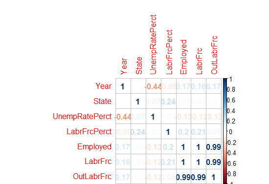
Fig-12: Correlation plot
As we can see from Fig-12, there are high correlations between variables, Employed - LaborForce; Employed - OutsideLaborForce and LaborForce - OutsideLaborForce.
- Multicollinearity
Multicollinearity occurs because two (or more) variables are related or they measure the same thing. If one of the variables in your model doesn’t seem essential to your model, removing it may reduce multicollinearity. Examining the correlations between variables and taking into account the importance of the variables will help you make a decision about what variables to drop from the model.
There are several methods for dealing with multicollinearity. The simplest is to construct a correlation matrix and corresponding scatterplots. If the correlations between predictors approach 1, then multicollinearity might be a problem. In that case, one can make some educated guesses about which predictors to retain in the analysis.
Use, Variance Inflation Factor (VIF). The VIF is a metric computed for every X variable that goes into a linear model. If the VIF of a variable is high, it means the information in that variable is already explained by the other X variables present in the given model, which means, more redundant is that variable. According to some references, if the VIF is too large(more than 5 or 10), we consider that the multicollinearity is existent. So, lower the VIF (<2) the better it is. VIF for a X var is calculated as; 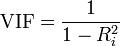
where, Rsq is the Rsq term for the model with given X as response against all other Xs that went into the model as predictors.
Practically, if two of the X′s have high correlation, they will likely have high VIFs. Generally, VIF for an X variable should be less than 4 in order to be accepted as not causing multicollinearity. The cutoff is kept as low as 2, if you want to be strict about your X variables. Now, assume we want to predict UnempRatePect (unemployment rate percent) from rest of the predictors, so we regress it over others as given below in the equation; > mod<- lm(Employed~., data=df.cmplt). We then calculate the VIF for this model by using the vif() method from the DAAG library, and find that the variables Employed, LabrFrc, OutLabrFrc, State are correlated.
> vfit<-vif(mod)
> sqrt(vif(mod)) > 2
      Year          State UnempRatePerct   LabrFrcPerct        LabrFrc     OutLabrFrc
     FALSE          FALSE          FALSE           TRUE           TRUE           TRUE
- Multicollinearity Treatment
Principal Component Analysis (PCA): unsupervised data reduction method
Principal Component Analysis (PCA) reduces the number of predictors to a smaller set of uncorrelated components. Remember, the PCA method can only be applied to continuous variables.
We aim to find the components which explain the maximum variance. This is because, we want to retain as much information as possible using these components. So, higher is the explained variance, higher will be the information contained in those components.
The base R function princomp() from the stats package is used to conduct the PCA test. By default, it centers the variable to have mean equals to zero. With parameter scale. = T, the variables (or the predictors) can be normalized to have standard deviation equals to 1. Since, we have already normalized the variables, we will not be using the scale option.
> library(stats) # for princomp()
> df.cmplt.norm.pca<- princomp(df.cmplt.norm, cor = TRUE)
> summary(df.cmplt.norm.pca)

Importance of components:
			Comp.1    	Comp.2    Comp.3    Comp.4     Comp.5        Comp.6       Comp.7
Standard
deviation   1.7588184 1.2020620 1.0730485 0.8807122 0.73074799 0.02202556837 0.0063283251
Proportion
of Variance 0.4419203 0.2064219 0.1644904 0.1108077 0.07628466 0.00006930367 0.0000057211
Cumulative
Proportion  0.4419203 0.6483422 0.8128326 0.9236403 0.99992498 0.99999427890 1.0000000000
From the above summary, we can see that the Comp.1 explains 44% variance, Comp.2 explains 20% variance and so on. Also we can see that Comp.1 to Comp.5 have the highest standard deviation which indicates the number of components to retain (for further data analysis) as they explain maximum variance in the data.
- Plotting the PCA (biplot) components
A PCA would not be complete without a bi-plot. In a biplot, the arrows point in the direction of increasing values for each original variable. The closeness of the arrows means that the variables are highly correlated. In Fig-13, notice the closeness of the arrows for variables, OutLabrFrc,Employed and LabrFrc indicates strong correlation. Again, notice the mild closeness of arrows for variable LabrFrcPerct,State and UnempRatePerct indicate mild correlation. Finally, notice the perpendicular distance between variables, Year and OutLabrFrc that indicates no correlation.
> # Plotting
> biplot(df.cmplt.norm.pca)
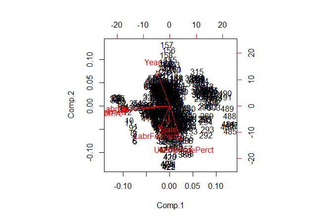
Fig-13: Biplot for PCA components
- Determining the contribution (%) of each parameter in the calculated PCA
Now, the important question is how to determine the percentage of contribution (of each parameter) to each PC? simply put, how to know that Comp.1 consist of say 35% of parameter1, 28% of parameter2 and so on.
The answer lies in computing the proportion of variance explained by each component, we simply divide the variance by sum of total variance. Thus we see that the first principal component Comp.1 explains 44% of variance. The second component Comp.2 explains 20% variance, the third component Comp.3 explains 16% variance and so on.
> std_dev<- df.cmplt.norm.pca$sdev
> df.cmplt.norm.pca.var<- std_dev^2
> round(df.cmplt.norm.pca.var)
Comp.1 Comp.2 Comp.3 Comp.4 Comp.5 Comp.6 Comp.7
	3      1      1      1      1      0      0
#proportion of variance explained
prop_varex <- df.cmplt.norm.pca.var/sum(df.cmplt.norm.pca.var)
 	> round(prop_varex,3)
Comp.1 Comp.2 Comp.3 Comp.4 Comp.5 Comp.6 Comp.7
 	0.442  0.206  0.164  0.111  0.076  0.000  0.000
Although, we have identified that Comp.1 to Comp.5 explain the maximum variance in the data but we use a scree plot for a visual identification too. A scree plot is used to access components or factors which explains the most of variability in the data. The cumulative scree plot in Fig-14, shows that 5 components explain about 99% of variance in the data. Therefore, in this case, we’ll select number of components as 05 [PC1 to PC5] and proceed to the modeling stage. For modeling, we’ll use these 05 components as predictor variables and follow the subsequent analysis.
> plot(cumsum(prop_varex), xlab = "Principal Component",
...     ylab = "Cumulative Proportion of Variance Explained",
...      type = "b")
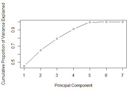
Fig-14: Cumulative Scree Plot for PCA
Now, we know that there are at least 5 components or variables in this dataset that exhibit maximum variance. Let us now see, what variables are these;
It is worth mentioning here that the principal components are located in the loadings component of the princomp() function. And if using the prcomp function, than the principal components are located in the rotation component.
Let’s now look at the first 5 PCA in first 5 rows
> df.cmplt.norm.pca$loadings[1:5,1:5]
                Comp.1      Comp.2      Comp.3      Comp.4      Comp.5
Year           -0.15571810  0.59924346 -0.33488893 -0.17721252  0.68781319
State          -0.01783084 -0.31630022 -0.66890937 -0.63612401 -0.21804005
UnempRatePerct  0.12931025 -0.60105660  0.34584708 -0.29005678  0.64662656
LabrFrcPerct   -0.12043003 -0.40426976 -0.53298376  0.68221483  0.24047888
Employed       -0.56396551 -0.08143999  0.07256198 -0.01140229 -0.02185788
We now demonstrate the relative contribution of each loading per column and express it as as a proportion of the column (loading) sum, taking care to use the absolute values to account for negative loading. See, this SO solution
> load <- with(df.cmplt.norm.pca, unclass(loadings))
> round(load,3)

               Comp.1 Comp.2 Comp.3 Comp.4 Comp.5 Comp.6 Comp.7
Year           -0.156  0.599 -0.335 -0.177  0.688  0.004  0.000
State          -0.018 -0.316 -0.669 -0.636 -0.218 -0.001  0.000
UnempRatePerct  0.129 -0.601  0.346 -0.290  0.647 -0.006 -0.010
LabrFrcPerct   -0.120 -0.404 -0.533  0.682  0.240  0.121 -0.003
Employed       -0.564 -0.081  0.073 -0.011 -0.022 -0.423 -0.700
LabrFrc        -0.563 -0.091  0.077 -0.015 -0.012 -0.399  0.714
OutLabrFrc     -0.556 -0.035  0.160 -0.118 -0.053  0.804 -0.014
And, this final step then yields the proportional contribution to the each principal component.
> aload <- abs(load) ## save absolute values
> round(sweep(aload, 2, colSums(aload), "/"),3)
               Comp.1 Comp.2 Comp.3 Comp.4 Comp.5 Comp.6 Comp.7
Year            0.074  0.282  0.153  0.092  0.366  0.002  0.000
State           0.008  0.149  0.305  0.330  0.116  0.001  0.000
UnempRatePerct  0.061  0.282  0.158  0.150  0.344  0.003  0.007
LabrFrcPerct    0.057  0.190  0.243  0.353  0.128  0.069  0.002
Employed        0.268  0.038  0.033  0.006  0.012  0.241  0.485
LabrFrc         0.267  0.043  0.035  0.008  0.006  0.227  0.495
OutLabrFrc      0.264  0.016  0.073  0.061  0.028  0.457  0.010
We already know that there are five components/variables with maximum variance in them. Now all that is left is to determine what are these variables. This can be determined easily from the above result. Remember, Comp.1 shows variables with maximum variance, followed by Comp.2 and so on. Now, in the column, Comp.1 we keep only those variables that are greater than 0.05. Therefore, the variables to keep are, Year, UnempRatePerct,Employed, LabrFrc, LabrFrcPerct and OutLabrFrc.
> vars_to_retain<- c("Year","Employed","UnempRatePerct","LabrFrc","LabrFrcPerct","OutLabrFrc")
> newdata<- df.cmplt.norm[,vars_to_retain]
> str(newdata)
'data.frame':	544 obs. of  6 variables:
 	$ Year          : num  1982 1983 1984 1985 1986 ...
 	$ Employed      : num  12.4 12.4 12.4 12.5 12.5 ...
 	$ UnempRatePerct: num  1.77 1.93 2.32 2.49 2.89 ...
 	$ LabrFrc       : num  12.4 12.5 12.5 12.5 12.6 ...
 	$ LabrFrcPerct  : num  6.02 6.04 6.03 6.04 6.05 ...
 	$ OutLabrFrc    : num  11.5 11.5 11.6 11.6 11.6 ...
Note: We will be building the model on the normalized data stored in the variable, df.cmplt.norm.
4. Predictive Data Analytics
In this section, we will discuss various approaches applied to model building, predictive power and their trade-offs.
A. Creating the train and test dataset
We now divide the data into 75% training set and 25% testing set. We also created a root mean square evaluation function for model testing.
> ratio = sample(1:nrow(newdata), size = 0.25*nrow(newdata))
> test.data = newdata[ratio,] #Test dataset 25% of total
> train.data = newdata[-ratio,] #Train dataset 75% of total
> dim(train.data)
[1] 408   4
> dim(test.data)
[1] 136  4
B. Model Building - Evaluation Method
We created a custom root mean square function that will evaluate the performance of our model.
# Evaluation metric function

RMSE <- function(x,y)
	{
  			a <- sqrt(sum((log(x)-log(y))^2)/length(y))
  			return(a)
	}
C. Model Building - Regression Analysis
Regression is a supervised technique, a statistical process for estimating the relationship between a response variable and one or more predictors. Often the outcome variable is also called the response variable or the dependent variable and the and the risk factors and confounders are called the predictors, or explanatory or independent variables. In regression analysis, the dependent variable is denoted y and the independent variables are denoted by x.
The response variable for this study is continuous in nature therefore the choice of regression model is most appropriate.
Our multiple linear regression model for the response variable Employed reveals that the predictors, UnempRatePerct and LabrFrc are the most significant predictors such that if included in the model will enhance the predictive power of the response variable. The remaining predictors do not contribute to the regression model.
> linear.mod<- lm(Employed~., data = train.data)
> summary(linear.mod)

Call:
lm(formula = Employed ~ ., data = train.data)

Residuals:
  Min        1Q    Median        3Q       Max
-0.060829 -0.002058  0.001863  0.004615  0.184889

Coefficients:
              	Estimate  	Std. Error 		t value 	Pr(>|t|)
(Intercept)    -0.38447474  0.34607122  	-1.111    	0.267
Year            0.00009844  0.00008295   	1.187    	0.236
UnempRatePerct -0.03869329  0.00119011 		-32.512   	<2e-16 ***
LabrFrc         0.97901237  0.01634419  	59.900   	<2e-16 ***
LabrFrcPerct    0.03468488  0.04784967   	0.725    	0.469
OutLabrFrc      0.02223528  0.01624485   	1.369    	0.172
---
Signif. codes:  0 ‘***’ 0.001 ‘**’ 0.01 ‘*’ 0.05 ‘.’ 0.1 ‘ ’ 1

Residual standard error: 0.01452 on 402 degrees of freedom
Multiple R-squared:  0.9999,	Adjusted R-squared:  0.9999
F-statistic: 1.223e+06 on 5 and 402 DF,  p-value: < 2.2e-16
The t value also known as the t-test which is positive for predictors, Year,LabrFrc,LabrFrcPerct and OutLabrFrc indicating that these predictors are associated with Employed. A larger t-value indicates that that it is less likely that the coefficient is not equal to zero purely by chance.
Again, as the p-value for variables, UnempRatePerct and LabrFrc is less than 0.05 they are both statistically significant in the multiple linear regression model for the response variable, Employed . The model’s, p-value: < 2.2e-16 is also lower than the statistical significance level of 0.05, this indicates that we can safely reject the null hypothesis that the value for the coefficient is zero (or in other words, the predictor variable has no explanatory relationship with the response variable).
We tested this model using the root mean square evaluation method. The RMSE is 0.003.
> RMSE0<- RMSE(predict, test.data$Employed)
> RMSE0<- round(RMSE0, digits = 3)
> RMSE0
[1] 0.003
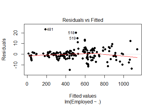
Fig-14: Residuals vs Fitted values for the response variable, “Employed”
> actuals_preds <- data.frame(cbind(actuals=test.data$Employed, predicteds=predict)) # make actuals_predicteds dataframe.
> correlation_accuracy <- cor(actuals_preds)
> correlation_accuracy # 99%
	         actuals 	predicteds
actuals    	1.0000000  	0.9999386
predicteds 	0.9999386  	1.0000000

> min_max_accuracy <- mean (apply(actuals_preds, 1, min) / apply(actuals_preds, 1, max))
> min_max_accuracy
[1] 0.9988304
> mape <- mean(abs((actuals_preds$predicteds - actuals_preds$actuals))/actuals_preds$actuals)
> mape
[1] 0.001170885
The AIC and the BIC model diagnostics values are low too. > AIC(linear.mod) [1] -2287.863 and > BIC(linear.mod) [1] -2259.784.
D. Model Building - other supervised algorithms
- Regression Tree method
The regression tree method gives an accuracy of 0.037
> library(rpart)
> model <- rpart(Employed ~., data = train.data, method = "anova")
> predict <- predict(model, test.data)
> RMSE1 <- RMSE(predict, test.data$Employed)
> RMSE1 <- round(RMSE1, digits = 3)
> RMSE1
[1] 0.037
- Random Forest method
The random forest method gives an accuracy of 0.009. Look at the IncNodePurity plot in Fig-15. We see that important predictors are Year, UnempRatePerct ,LabourFrcPerct
> library(randomForest)
> model.forest <- randomForest(Employed ~., data = train.data, method = "anova",
...                              ntree = 300,
...                              mtry = 2, #mtry is sqrt(6)
...                              replace = F,
...                              nodesize = 1,
...                              importance = T)
> varImpPlot(model.forest)
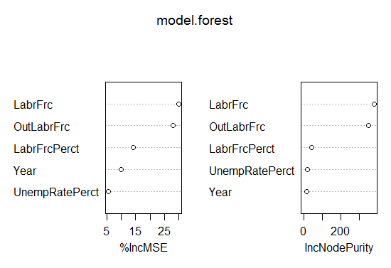
Fig-15: VIF plot
> prediction <- predict(model.forest,test.data)
> RMSE3 <- sqrt(mean((log(prediction)-log(test.data$Employed))^2))
> round(RMSE3, digits = 3)
[1] 0.009
D.1 Model Performance comparison
As a rule of thumb, smaller the RMSE value better is the model. See this SO post. So its feasible to state that the multiple linear regression model yields the best predictive performance as it has the lowest RMSE value of 0.003.
Multiple Linear Regression RMSE: 0.003
Random Forest RMSE: 0.009
Regression Tree RMSE: 0.037
5. Conclusion
In this analytical study, we have explored three supervised learning models to predict the factors contributing to an accurate prediction of employed persons by state in Malaysia. Our multiple linear regression model for the response variable Employed reveals that the predictors, UnempRatePerctand LabrFrc are the most significant predictors such that if included in the model will enhance the predictive power of the response variable. The other predictors such as Year, OutLabrFrc, LabrFrcPerctdoes not contribute to the regression model. This model gives an accuracy of 99% on unseen data and has the lowest RMSE of 0.003 as compared to the other supervised learning methods. Again, its worthwhile to mention here the reason for such a high accuracy of the predictive model because we chose the correct model for the response variable and ensured to carry out a rigorous data preprocessing and modeling activities.
The complete code is listed on my Github repository in here
comments powered by Disqus