Introduction
Malaysia is the leading producer of natural rubber in the world. Being a leader in the production of natural rubber, Malaysia is contributing around 46% of total rubber production in the world. The rubber plantation was started in Malaysia in 1877.
The favorable rubber plantation climate requires a mean temperature of 27°C, never falling below 22°C. It also requires heavy rainfall above 200 cm. with no drought including deep rich soils with good drainage preferably brittle, well-oxidized and acidic in reaction. Sufficient supply of labour is an important factor for the collection and plantation of rubber over large holdings.
In Malaysia, rubber can grow anywhere, because of the suitability of climate and top soil; but most of the rubber estates are located in the western coastal plains of Malaysia. The plantation in coastal zone gets the benefit of nearest port for its export. Yet very low areas are avoided in order not to suffer from stagnation of water. The greatest production is in it’s Johor State of Southern Malaysia. Over here the rubber cultivation occupies about 4-2 million acres or about 66% of the total cultivated area in the nation.
This report consist of the following sections;
-
Business/Research Question
-
Data Source
-
Making data management decisions
- Predictive Data Analytics
- Conclusion
References
1. Business/Research Question
Determine the factors which contribute to accurately predicting high rubber yield per kg based on historical rubber plantation data.
2. Data Source
The data comes from the Department of Statistics, Malaysia. This is an open data source portal and the data files can be accessed from their official website
3. Making data management decisions
Initially, the dataset consisted of six comma-separated files. Each file provided data (from year 1965 to year 2014) on factors like number of rubber estates in Malaysia, total planted area, production of natural rubber, tapped area, yield per hectare and total number of paid employees in the rubber estate.
A. Exploratory Data Analysis (EDA)
Each data file had the same dimension of 51 rows in 2 continuous variables. On knowing that each of the six-data file had the same dimensions, it confirmed our initial assumption that the actual dataset was divided into six separate files.
> df1<- read.csv("data/rubberestate/rubber-paidemployee.csv", header = TRUE, sep = ",", stringsAsFactors = FALSE)
> df2<- read.csv("data/rubberestate/rubber-plantedarea.csv", header = TRUE, sep = ",", stringsAsFactors = FALSE)
> df3<- read.csv("data/rubberestate/rubber-production.csv", header = TRUE, sep = ",", stringsAsFactors = FALSE)
> df4<- read.csv("data/rubberestate/rubber-taparea.csv", header = TRUE, sep = ",", stringsAsFactors = FALSE)
> df5<- read.csv("data/rubberestate/rubber-yield.csv", header = TRUE, sep = ",", stringsAsFactors = FALSE)

> dim(df1)
[1] 51  2
> dim(df2)
[1] 51  2
> dim(df3)
[1] 51  2
> dim(df4)
[1] 51  2
> dim(df5)
[1] 51  2
Another peculiarity found was the column headings were too long for each of the data file. We decided to merge the six data files into a single dataset and rename the column names to short succinct names. For data analysis we are using the R programming language (Ihaka & Gentleman, 1996).
Besides, we also found that column value for number of employees was expressed in decimals! Now, there cannot be 2.5 employees so we decided to round all such values.
> names(df1)
[1] "Year"
[2] "Total.Number.of.Paid.Employee.During.the.Last.Pay.Period..Estate."
> names(df2) # additional space after column names. do formatting
[1] "Year"                                 "Planted.Area..Estate....000..Hectare"
> names(df3)
[1] "Year"                             "Production..Estate....000..Tonne"
> names(df4)
[1] "Year"                                "Tapped.Area..Estate....000..Hectare"
> names(df5)
[1] "Year"                            "Yeild.per.Hectare..Estate...Kg."

> head(df1) # You cannot have employees in decimals. Round this variable
  Year Total.Number.of.Paid.Employee.During.the.Last.Pay.Period..Estate.

1 1965                                                             262.1

2 1966                                                             258.4

3 1967                                                             235.4

4 1968                                                             209.8

5 1969                                                             212.7

6 1970                                                             205.4
So, we first decided to perform basic data management tasks that were identified above. For this we use the rename function in the plyr library (Wickham, 2015).
You will need to load this library in the R environment first before you can use the rename function.
-
Data preprocessing (rename and round)
> # Basic Data Management > # Renaming the column name > library(plyr) > df1<- rename(df1, c("Total.Number.of.Paid.Employee.During.the.Last.Pay.Period..Estate." = "TotalPaidEmployee")) > df2<-rename(df2, c("Planted.Area..Estate....000..Hectare" = "AreaPlantedHect")) > df3<-rename(df3, c("Production..Estate....000..Tonne" = "ProduceTonne")) > df4<-rename(df4, c("Tapped.Area..Estate....000..Hectare" = "TapAreaHect")) > df5<-rename(df5, c("Yeild.per.Hectare..Estate...Kg." = "YieldperHectKg")) > # Rounding the column value for TotalPaidEmployee because there can’t be example 2.5 employees > df1$TotalPaidEmployee<- round(df1$TotalPaidEmployee) -
Data pre-processing (joining the tables)
We also notice that all the six data files have a common column which is,
Year. So, we now join the files on this common column and save the resultant in a master data frame called,df.master. This process is known as theinner join.> # Inner Join the data frames on common column > df.m1<- merge(df1,df2, by="Year") > df.m2<- merge(df3,df4, by="Year") > df.m3<- merge(df.m2, df5, by="Year") > df.master<- merge(df.m1, df.m3, by="Year")Now, that the dataset is ready for inspection, the first step would be to summarize it using the
summaryfunction call.> summary(df.master) Year TotalPaidEmployee AreaPlantedHect ProduceTonne TapAreaHect YieldperHectKg Min. :1965 Min. : 10.00 Min. : 49.70 Min. : 53.00 Min. : 38.50 Min. : 937 1st Qu.:1977 1st Qu.: 16.75 1st Qu.: 87.47 1st Qu.: 88.62 1st Qu.: 64.62 1st Qu.:1304 Median :1990 Median :105.00 Median :354.85 Median :414.70 Median :307.05 Median :1381 Mean :1990 Mean :103.62 Mean :352.94 Mean :364.27 Mean :277.42 Mean :1347 3rd Qu.:2002 3rd Qu.:174.50 3rd Qu.:554.25 3rd Qu.:580.98 3rd Qu.:433.40 3rd Qu.:1420 Max. :2014 Max. :262.00 Max. :788.50 Max. :684.60 Max. :542.30 Max. :1525 NA's :1 NA's :1 NA's :1 NA's :1 NA's :1 NA's :1
We see that the minimum yield per hectare is 937 kg and the minimum area planted is 49.7 hectares. Besides, there is also one data point with missing value.
-
Missing data treatment
We have applied the predictive mean modeling method for missing data imputation. This method is available in the
mice(Buuren & Groothuis-Oudshoorn, 2011) library. You will need to load it in the R environment first.>library(mice) > tempData <- mice(df.master,m=5,maxit=50,meth='pmm',seed=1234) > df.master<- mice::complete(tempData,1) > colSums(is.na(df.master)) Year TotalPaidEmployee AreaPlantedHect ProduceTonne TapAreaHect YieldperHectKg 0 0 0 0 0 0
Now, the dataset is ready for visualization. This will help us in determining a research question. At this point it’s best to describe about our dataset. for this, we use the method describe from the psych library (Revelle, 2014). A basic example can be see here
B. Data visualization: visualizing data in pursuit of finding relationship between predictors
We begin the data exploration by univariate data visualization. Here, we will be using the %>% or the pipe operator from the magrittr package (Bache & Wickham, 2014) and select statement from the dplyr package (Wickham & Francois, 2015) to visualize all the predictors excluding Year.
> library(magrittr)
> library(dplyr)
> # Method 1: selecting individual predictor name
> boxplot(df.master %>%
...           select(AreaPlantedHect,YieldperHectKg,ProduceTonne,TapAreaHect,TotalPaidEmployee))
> # Method 2: Use the minus sign before the predictor you dont want to plot such that the remaining predictors are plotted

> boxplot(df.master %>%
...           select(-Year),
...         col = c("red","sienna","palevioletred1","royalblue2","brown"),
...         ylab="Count", xlab="Predictors"
...         )
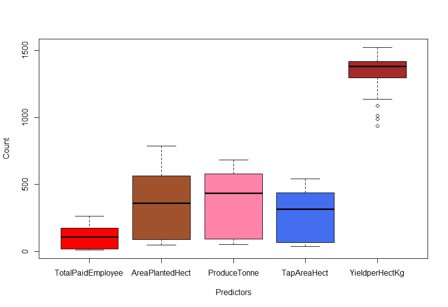
Fig-1: Boxplot
From Fig-1, it seems that there are some outlier’s for the YieldperHectKg predictor. We will come to it later, for now, we continue exploring the data.
Now, we use the line plots to determine relationships between continuous predictors.
> ggplot(df.master)+ geom_line(aes(x=AreaPlantedHect, y=YieldperHectKg, color=”red”))
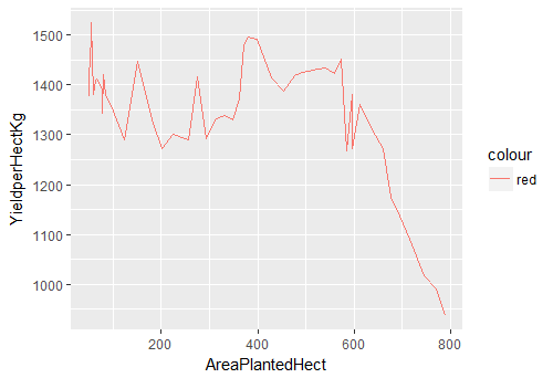
Fig-2: Line Plot for predictors AreaPlantedHect and YieldperHectKg
An interesting pattern is revealed in Fig-2. The yield per hectare has a sharp decline (after 600 hectares) as plantation area increases.
Lets’ explore the remaining predictors;
> ggplot(df.master)+ geom_line(aes(x=AreaPlantedHect, y=ProduceTonne, color="red"))
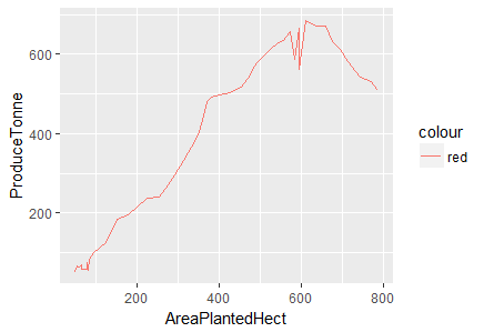
Fig-3: Line Plot for predictors AreaPlantedHect and ProduceTonne
We see that produce increases with area but then it begins to decline after 600 hectares. There is a positive linear relationship between area planted and tap area as shown below in Fig-4.
> ggplot(df.master)+ geom_line(aes(x=AreaPlantedHect, y=TapAreaHect, color="red"))
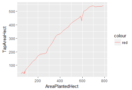
Fig-4: Line Plot for predictors AreaPlantedHect and TapAreaHect
Again, in Fig-5, we notice a positive linear relationship between area planted and paid employees but there is a sharp decline at 600 hectares persists.
> ggplot(df.master)+ geom_line(aes(x=AreaPlantedHect, y=TotalPaidEmployee, color="red"))
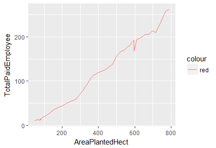
Fig-5: Line Plot for predictors AreaPlantedHect and TotalPaidEmployee
The evidence of strong positive linear relationship between the predictors, AreaPlantedHect, TapAreaHect, TotalPaidEmployee and ProduceTonne cannot be overlooked. We, cross-check this phenomenon by deducing the correlation between them.
> cor(df.master$AreaPlantedHect, df.master$TapAreaHect) # very strong positive correlation
[1] 0.9930814
> cor(df.master$AreaPlantedHect, df.master$ProduceTonne) # very strong positive correlation
[1] 0.9434092
> cor(df.master$AreaPlantedHect, df.master$TotalPaidEmployee) # very strong positive correlation, as land size increases more labour is required
[1] 0.9951871
> cor(df.master$AreaPlantedHect, df.master$YieldperHectKg) # negative correlation, proving the point above that the yield per hectare decreases as plantation size increases
[1] -0.5466433
we now have ample evidence that the predictors, TotalPaidEmployee,AreaPlantedHect,ProduceTonee and TapAreaHect have a strong positive correlationship. Let’s visualize it.
> correlations<- cor(df.master)

> corrplot(correlations, method="number")
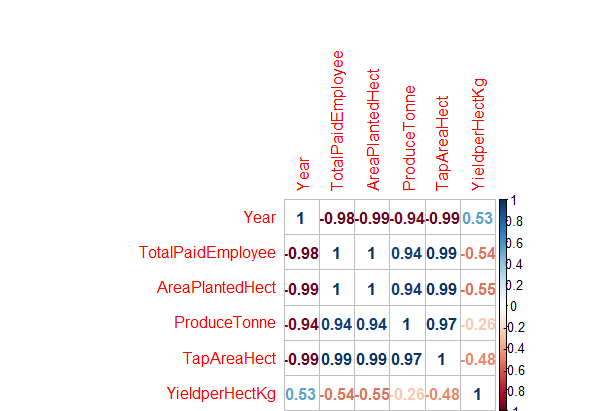
Fig-6: Correlation Plot for predictors and response variables.
As seen in Fig-6 above, the predictors Year and YieldPerHect have low positive correlation with each other; TotalPaidEmployee and YieldHect have a semi-strong negative correlation; others like AreaPlantedHect and YieldPerHect have a strong negative correlation and ProduceTonne and YieldperhectKg have a low negative correlation with each other.
We can also create a scatter plot matrix (see Fig-7) to plot correlations among the continuous predictors by using the pairs function from the ggplot2 library(Wickham, 2016)
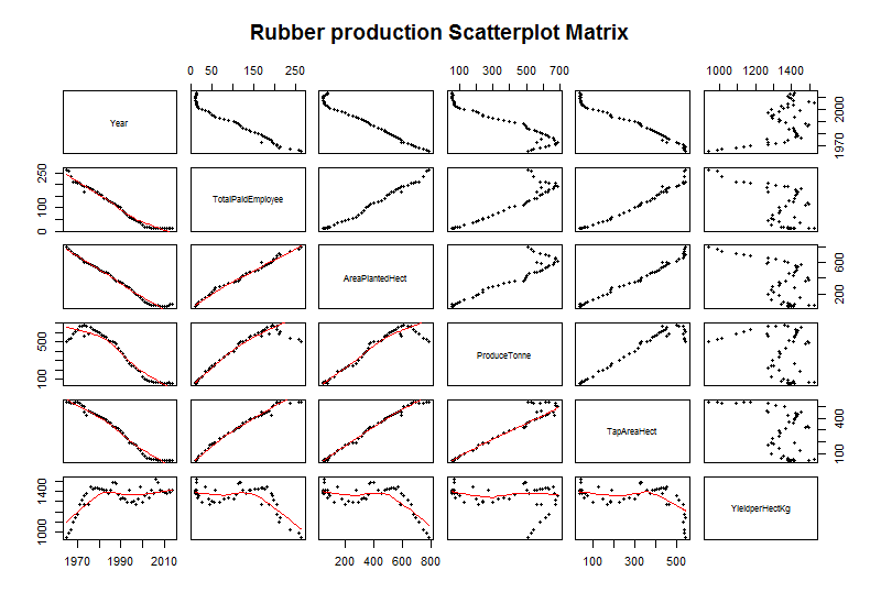
Fig-7: Scatter plot matrix for predictor and response variable correlation
We end this discussion by a simple question. Does the yield increase if the plantation area increases? Lets find this out in the following graph, see Fig-8.
> library (RColorBrewer)
# We will select the first 4 colors in the Set1 palette
> cols<-brewer.pal(n=4,name="Set1")
# cols contain the names of four different colors
> plot(Training$AreaPlantedHect, Training$YieldperHectKg, pch=16,col=cols,
 main=" Does high plantation area yield more rubber?",
 xlab = "Area planted (in hectare)",
 ylab = "Yield in Kg (per hectare)"
 )
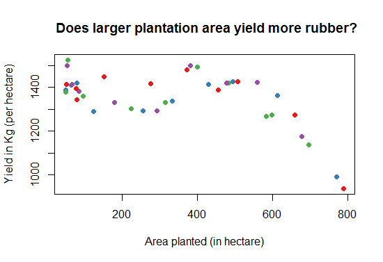
Fig-7: Scatter plot matrix for predictor and response variable correlation
C. Data transformation
- Skewed variable treatment
A variable is considered ‘highly skewed’ if its absolute value is greater than 1. A variable is considered ‘moderately skewed’ if its absolute value is greater than 0.5. let’s check if any of the predictors are skewed or not.
> for(i in names(df.master)){
...   if(is.numeric(df.master[,i])){
...     if(i != "YieldperHectKg"){
...       # Enters this block if variable is non-categorical
...       skewVal <- skewness(df.master[,i])
...       print(paste(i, skewVal, sep = ": "))
...       if(abs(skewVal) > 0.5){
...         skewedVars <- c(skewedVars, i)
...       }
...     }
...   }
... }

[1] "Year: 0.0380159253762087"
[1] "TotalPaidEmployee: 0.238560934226388"
[1] "AreaPlantedHect: 0.118115337328111"
[1] "ProduceTonne: -0.184114105316565"
[1] "TapAreaHect: -0.0526176590077839"
There are no skewed predictors.
D. Feature importance
Now, that we have statistically quantified the validity of the predictors, we proceed to determining the most relevant features. Such features when found will help in building a robust predictive model. We will use the Boruta package (Kursa & Rudnicki, 2010).
We are interested in predicting the variable Yield per hectare in kg (YieldperHectKg) therefore we will remove it from the feature selection process and perform the analysis on the remaining predictors.
> library(Boruta)
> set.seed(1234) # for code reproducibility
> response <- df.master$YieldperHectKg
> response <- df.master$YieldperHectKg
> bor.results <- Boruta(df.master,response,
...                       maxRuns=101,
...                       doTrace=0)

> cat("\n\nRelevant Attributes:\n")
	Relevant Attributes:
> getSelectedAttributes(bor.results)
[1] "Year"              "TotalPaidEmployee" "AreaPlantedHect"   "ProduceTonne"      "TapAreaHect"
[6] "YieldperHectKg"
> plot(bor.results)
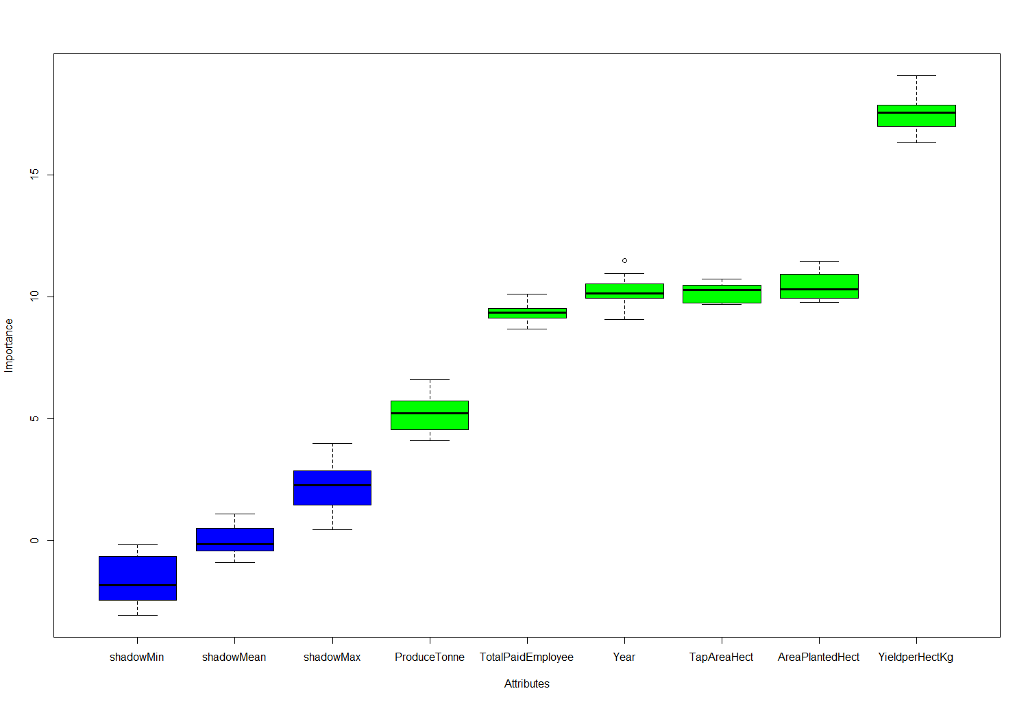
Fig-8: Feature importance plot
We see from Fig-8, that Boruta predicts all the features to be important for building a predictive model. Let us know proceed to building the predictive model.
4. Predictive Data Analytics
In this section, we will discuss various approaches in model building, predictive power and their trade-offs.
A. Creating the train and test dataset
Researchers and data practitioners have always emphasized on building a model that is intensively trained on a larger sample of the train data. Therefore, we will divide the dataset into 70% training data and 30% testing data.
> ratio = sample(1:nrow(df.master), size = 0.25*nrow(df.master))
> Test = df.master[ratio,] #Test dataset 25% of total
> Training = df.master[-ratio,] #Train dataset 75% of total
> dim(Training)
[1] 39  6
> dim(Test)
[1] 12  6
B. Model Building - Evaluation Method
We created a custom root mean square function that will evaluate the performance of our model.
# Evaluation metric function

RMSE <- function(x,y)
	{
  			a <- sqrt(sum((log(x)-log(y))^2)/length(y))
  			return(a)
	}
C. Model Building - Regression Analysis
Regression is a supervised technique, a statistical process for estimating the relationship between a response variable and one or more predictors. Often the outcome variable is also called the response variable or the dependent variable and the and the risk factors and confounders are called the predictors, or explanatory or independent variables. In regression analysis, the dependent variable is denoted y and the independent variables are denoted by x.
Regression analysis is a widely used technique which is useful for evaluating multiple independent variables. It serves to answer the question, “Which factors matter the most?”. Interested readers should see (Kleinbaum, Kupper and Muller, 2013) for more details on regression analysis and its many applications.
We then, created a multiple linear regression model for the response variable YieldperHectKg and the summary statistic showed that the predictors, TapAreaHect, ProduceTonne and TotalPaidEmployee are the most significant predictors such that if included in the model will enhance the predictive power of the response variable.
The other predictors like Year and AreaPlantedHect do not contribute to the regression model.
> linear.mod<- lm(YieldperHectKg~., data = Training)
> summary(linear.mod)

Call:
lm(formula = YieldperHectKg ~ ., data = Training)

Residuals:
Min      1Q  Median      3Q     Max
-73.203 -23.203  -1.562  13.087 108.326

Coefficients:
                	Estimate Std. Error t value       Pr(>|t|)
(Intercept)       -1839.5867  5221.4502  -0.352        0.72684
Year                  1.6199     2.5965   0.624        0.53699
TotalPaidEmployee     2.1835     0.7680   2.843        0.00761 **
AreaPlantedHect      -0.4247     0.4927  -0.862        0.39490
ProduceTonne          2.1643     0.2541   8.518 0.000000000764 ***
TapAreaHect          -3.2198     0.9014  -3.572        0.00111 **
---
Signif. codes:  0 ‘***’ 0.001 ‘**’ 0.01 ‘*’ 0.05 ‘.’ 0.1 ‘ ’ 1

Residual standard error: 36.69 on 33 degrees of freedom
Multiple R-squared:  0.9244,	Adjusted R-squared:  0.913
F-statistic: 80.74 on 5 and 33 DF,  p-value: < 2.2e-16
The t value also known as the t-test which is positive for predictors, Year, TotalPaidEmployee, AreaPlantedHect,ProduceTonne and TapAreaHect indicating that these predictors are associated with YieldperHectKg. A larger t-value indicates that that it is less likely that the coefficient is not equal to zero purely by chance.
Again, as the p-value for ProduceTonne, TapAreaHect and TotalPaidEmployee is less than 0.05 they are both statistically significant in the multiple linear regression model for YieldperHectKg response variable. The model’s, p-value: < 2.2e-16 is also lower than the statistical significance level of 0.05, this indicates that we can safely reject the null hypothesis that the value for the coefficient is zero (or in other words, the predictor variable has no explanatory relationship with the response variable).
In Regression, the Null Hypothesis is that the coefficients associated with the variables is equal to zero. The alternate hypothesis is that the coefficients are not equal to zero (i.e. there exists a relationship between the independent variable in question and the dependent variable).
We tested this model using the root mean square evaluation method.
Note, we did not remove the non-contributing predictors from the regression model and found the RMSE to be quite low of 0.045. This model has an F-statistic of 80.74 which is considerably high and better.
Next, we performed the model prediction on unseen data.
> predict<- predict(linear.mod, Test)
> RMSE0<- RMSE(predict, Test$YieldperHectKg)
> RMSE0
[1] 0.04533296
D. Model Performance on various supervised algorithms
We now test the model performance on some supervised algorithms to determine the model’s prediction accuracy.
-
Regression Tree method
> library(rpart) > model <- rpart(YieldperHectKg ~., data = Training, method = "anova") > predict <- predict(model, Test) # RMSE > RMSE1 <- RMSE(predict, Test$YieldperHectKg) > RMSE1 <- round(RMSE1, digits = 3) > RMSE1 > [1] 0.098 -
Random Forest method
  > model.forest <- randomForest(YieldperHectKg ~., data = Training, method = "anova",
                ntree = 300,
                mtry = 2, #mtry is sqrt(6)
                replace = F,
                nodesize = 1,
                importance = T)


  > varImpPlot(model.forest) # Look at the IncNodePurity plot. From this plot we see that important vars are `TotalPaidEmployee`, `ProduceTonne` and `TapAreaHect`

  > prediction <- predict(model.forest,Test)

  > rmse <- sqrt(mean((log(prediction)-log(Test$YieldperHectKg))^2))

  > round(rmse, digits = 3) # 0.049
The Variance Inflation Factor (VIF) plot shows the predictors, TotalPaidEmployee, ProduceTonne and TapAreaHect as most important.
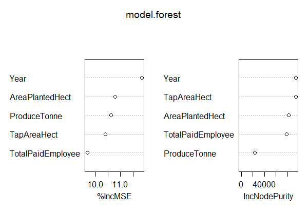
Fig-9: VIF plot
D.1. Comparison of Predictive Model Performance
So to predict the response variable, YieldperHectKg the best results were given by Regression Tree based model which gave an accuracy of 98% as compared to others;
Linear Regression: 0.04533296
Regression Tree RMSE: 0.098
Random Forest RMSE:  0.049
E. Model Diagnostics
i. The p Value: Checking for statistical significance
It is extremely important for the model to be statistically significant before we can go ahead and use it to predict (or estimate) the dependent variable, otherwise, the confidence in predicted values from that model reduces and may be construed as an event of chance.
In this model linear.mod the p-Values of the predictors are well below the 0.05 threshold, so we can conclude our model is indeed statistically significant. This can visually be interpreted by the significance stars at the end of the row. The more the stars beside the variable’s p-Value, the more significant the variable is.
ii. Check the AIC and BIC
The Akaike’s Information Criterion AIC (Akaike, 1974) and the Bayesian Information Criterion BIC (Schwarz, 1978) are measures of the goodness of fit of an estimated statistical model and can also be used for model selection.
Both criteria depend on the maximized value of the likelihood function L for the estimated model.
The AIC is defined as: AIC = (−2) • ln (L) + 2 • k where k is the number of model parameters and the BIC is defined as: BIC = (−2) • ln(L) + k • ln(n) where n is the sample size.
> AIC(linear.mod)
[1] 399.1521
> BIC(linear.mod)
[1] 410.797
For model comparison, the model with the lowest AIC and BIC score is preferred. Suppose, we had build another linear model with only two predictors, ProduceTonne and TapAreaHect given as;
> linear.mod1<- lm(YieldperHectKg~ProduceTonne+TapAreaHect, data = Training)
> AIC(linear.mod1)
[1] 402.8458
> BIC(linear.mod1)
[1] 409.5001
The AIC & BIC for linear.mod is lower than the linear.mod1 therefore, linear.mod is a better model for predicting the response variable.
iii. The R-Squared and Adjusted R-Squared
The actual information in a data is the total variation it contains. What R-Squared tells us is the proportion of variation in the dependent (response) variable that has been explained by this model.
Also, we do not necessarily have to discard a model based on a low R-Squared value. It’s a better practice to look at the AIC and prediction accuracy on validation sample when deciding on the efficacy of a model.
What about the adjusted R-Squared? As you add terms to your model, the R-Squared value of the new model will always be greater than that of its subset. This is because, since all the variables in the original model is also present, their contribution to explain the depend variable still remains in the super-set and therefore, whatever new variable we add can only enhance (if not significantly) what was already explained.
Here is how, the adjusted R-Squared value comes to help. Adj R-Squared penalizes total value for the number of terms (read predictors) in your model.
Therefore, when comparing nested models, it is a good practice to look at adj-R-squared value over R-squared.
We also have an adjusted r-square value (we’re now looking at adjusted R-square as a more appropriate metric of variability as the adjusted R-squared increases only if the new term added ends up improving the model more than would be expected by chance). In this model, we arrived in a larger R-squared number of 0.94
iv. How do you know if the model is best fit for your data?
The most common metrics to look at while selecting the model are:
r-squared- Higher the better
Adj. r-squared- Higher the better
AIC- Lower the better
BIC- Lower the better
MAPE (Mean Absolute Percentage Error)- Lower the better
MSE (Mean Squared Error)- Lower the better
Min_Max Accuracy- Higher the better
RMSE- lower the better
v. Residuals
The difference between the observed value of the dependent variable (y) and the predicted value (ŷ) is called the residual (e). Each data point has one residual.
Residual = Observed value - Predicted value
e = y - ŷ
Both the sum and the mean of the residuals are equal to zero. That is, Σ e = 0 and e = 0.
A residual plot is a graph that shows the residuals on the vertical axis and the independent variable on the horizontal axis. If the points in a residual plot are randomly dispersed around the horizontal axis, a linear regression model is appropriate for the data; otherwise, a non-linear model is more appropriate.
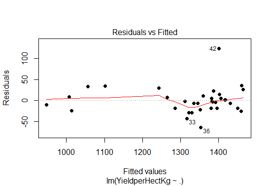
Fig-10: Residual plot
From the residual plot in Fig-10, we see the points are randomly distributed, thus the choice of our multiple linear regression was appropriate in predicting the response variable.
F. Model Inference Summary
From the model diagnostics, we see that the model p value and predictor’s p value are less than the significance level, so we know we have a statistically significant model. Also, the R-Sq and Adj R-Sq are comparative to the original model built on full data.
G. Calculate prediction accuracy and error rates
A simple correlation between the actuals and predicted values can be used as a form of accuracy measure.
A higher correlation accuracy implies that the actuals and predicted values have similar directional movement, i.e. when the actuals values increase the predicted also increase and vice-versa.
> predict<- predict(linear.mod, Test)
> actuals_preds <- data.frame(cbind(actuals=Test$YieldperHectKg, predicteds=predict)) # make actuals_predicteds dataframe.
> correlation_accuracy <- cor(actuals_preds)
> correlation_accuracy

         actuals predicteds
actuals    1.0000000  0.9447834
predicteds 0.9447834  1.0000000
The prediction accuracy of the model linear.mod on unseen data is 94%
Now let’s calculate the Min Max accuracy and MAPE
> min_max_accuracy <- mean (apply(actuals_preds, 1, min) / apply(actuals_preds, 1, max))
> min_max_accuracy
[1] 0.9721728
> mape <- mean(abs((actuals_preds$predicteds - actuals_preds$actuals))/actuals_preds$actuals)
> mape
[1] 0.02970934
Looks like we have a good model in here because the MAPE value is 0.029 which is quite low and min max accuracy of 0.97 which is quite high.
5. Conclusion
In building a data powered case study, the primary component is the research/business question, that takes precedence above anything else. Experience has taught us that if one cannot think of a feasible research question then its best to perform exploratory data analysis first. This exploratory phase serves many purposes like it gives you a first hand account of the data at hand (in terms of missing value, outliers, skewness, relationships etc). During the exploratory phase, ensure to document and justify data management decisions so as to maintain data accountability and data transparency. This process subsequently leads in formulating the research question. Another approach could be to perform an extensive literature review, find the gap in existing literature, formulate the problem and then acquire the relevant dataset to answer the problem. Both approaches are correct but at the beginner level we would recommend the former approach because you will be more closer to active action rather than passive thinking.
Continuing further, in tree based models where the response or target variable can take a finite set of values are called, classification tree’s. In these tree structures, the leaves represent the class labels and the branches represent the node of features that lead to those class labels. On the contrary the decision trees where the response or target variable can take continuous value (like price of a house) are called regression trees. The term, Classification and Regression Trees (CART) is thus an umbrella term that combines both the procedures.
As we have seen so far, a rigorous model testing must be applied to build an efficient model. The predictors, ProduceTonne is most significant for prediction of the response variable, YieldperHectKg and is closely followed by other predictors, TotalPaidEmployee and TapAreaHect. We also see that Regression tree based approach give 98% accuracy in predicting the response variable while Random Forest model (0.049%) does not even come close.
The reason we achieved such an high predictive accuracy for regression tree based model was because there was a strong positive linear relationship between the predictors and this works best for regression tree accuracy. In Fig-11, we show a graphical representation of which type of decision tree to use. The random forest algorithm would have served a response variable with finite set of values better. A simple and good introduction to understanding random forest is given here.
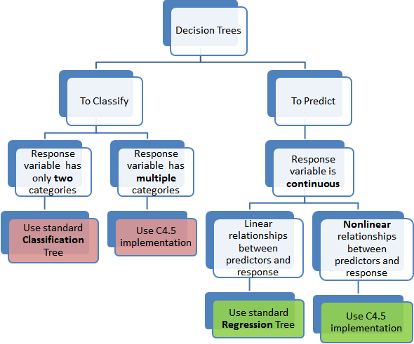
Fig-11: Which Decision Tree method to use
Another, hat tip for beginners in data science is to look at the response variable in deciding which algorithm to use. In this case study, the response variable was continuous in nature with strong positive linear relationship among the predictors. Therefore, the choice of regression trees was ideal.
The complete code is listed on my Github repository in here
References
Bache, S. M., & Wickham, H. (2014). Magrittr: A forward-pipe operator for R. R package version, 1(1).
Buuren, S., & Groothuis-Oudshoorn, K. (2011). mice: Multivariate imputation by chained equations in R. Journal of Statistical Software, 45(3).
Ihaka, R., & Gentleman, R. (1996). R: a language for data analysis and graphics. Journal of computational and graphical statistics, 5(3), 299-314.
Kursa, M. B., & Rudnicki, W. R. (2010). Feature selection with the Boruta package: Journal of Statistical Software.
Revelle, W. (2014). psych: Procedures for personality and psychological research. Northwestern University, Evanston. R package version, 1(1).
Wickham, H. (2015). plyr: Tools for splitting, applying and combining data. R package version 1.8. 1. R Found. Stat. Comput., Vienna.
Wickham, H. (2016). ggplot2: elegant graphics for data analysis: Springer.
Wickham, H., & Francois, R. (2015). dplyr: A grammar of data manipulation. R package version 0.4, 1, 20.
Kleinbaum, D., Kupper, L., Nizam, A., & Rosenberg, E. (2013). Applied regression analysis and other multivariable methods. Nelson Education.
comments powered by Disqus